Statistics Professor Hides Pictures, Messages in Problem Solutions

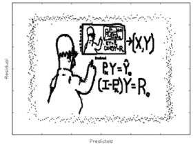
Say you’re an aspiring statistician who has just spent hours trying to figure out the answer to a particularly thorny problem. As you plug the final numbers into the computer program you’re running in order to confirm your analysis, an image takes shape on the screen: Homer Simpson, working a problem on a blackboard. What would your reaction be?
For students of Dr. Len Stefanski, professor of statistics at North Carolina State University, it’s usually more “Whoa!” than “D’oh!”
Stefanski has developed a method for hiding messages and pictures in data sets that only appear when a student or statistician has correctly analyzed the data via regression analysis, a statistical process for studying how one variable depends on others.
His innovative approach to making statistical analysis fun is featured in the May edition of The American Statistician.
“Regression analysis is used in every scientific field,” Stefanski says. “It’s a way to describe how one variable depends upon other variables – for example, you can use regression analysis to discover how blood pressure is affected by cholesterol, weight, diet and other risk factors. Or how temperatures in different parts of the ocean might affect the number of hurricanes that occur in a given season.”
When statisticians do regression analysis, they use computer programs to help them discover trends and variability within a given set of data. The programs plot the data as dots in an onscreen graph. A statistician looking at the relationship between height and weight, for example, would expect the general trend in the graph to be that weight increases with height – and that the majority of the dots in the graph would fall along that trend. However, there are always exceptions – people who don’t fit the pattern or trend. These exceptions would show up as “scatter” in the computer model, or random dots on the screen.
“The challenge for the statistician is to find the correct trend in a data set,” Stefanski says. “If you’ve done the analysis correctly and extracted the trend from the data, then all you should be left with onscreen when you’re finished is the random scatter, and I wanted to find a way to make the payoff for getting the right answer a bit more interesting for students.”
Stefanski created a simple computer program that allowed him to “hide” images or messages in data sets. When a student successfully identifies and removes the trend data from the set, the message or picture is revealed in what is known as a residual plot. He has made the data sets available to colleagues and the public on his Web site, and will make the computer program he created available soon as well.
“It’s not a terribly efficient means of encryption,” Stefanski says, “but it certainly makes statistical analysis more visually interesting.”
Source: NC State University


